A dream delicious client
- Posted
11 October 2004 - Updated
17 November 2006
A little over a month ago I mentioned my contemplation of tag based bookmark management. Since then I have made a commitment of sorts to move my links to del.icio.us. Lately, instead of working though my bookmarks and uploading the links I want to keep, I have been thinking about how I would like to explore and navigate these links later.
Tom Coates’s of plasticbag.org recently suggested tag based bookmarking could be integrated into Safari. Tom’s post prompted the precipitation of my own thoughts on the topic.
A while back I collated all my bookmarks in the various browsers that were kicking around my machines at home and work. Although time consuming it left my bookmarks nicely organised – in Camino, at home. For an impressive stretch I shuttled my bookmarks file between machines on my iPod. Predictably my discipline eventually wavered and my bookmark files have once again diverged as I continued to add and delete links. Meanwhile browser options on the Mac are flourishing. Camino’s lack of DOM inspector and poor Flash support led me and my bookmarks to move to Firefox, with browsers like OmniWeb appearing the chances of me shifting again are high. The best storage solution for bookmarks would appear to be independent of the browser. Hello del.icio.us!
The drawback of accessing information stored on a web service is the standard HTML form is sluggish and limiting when compared to that of a equivalent desktop application. Buzz Andersen’s answer to this challenge is Cocoalicious. A promising application for Mac OS X that connects to the del.icio.us API and brings those links just a bit closer. I’ve allowed myself to dream a little about a possible future for Cocoalicious and created a crude mockup that includes some of the interface ideas I have in mind.
With Cocoalicious as a launching pad the first thing I’d like to add is
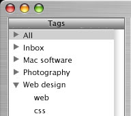
a means of selecting multiple tags in the tags column. You can perform a
similar AND search of your links in Cocoalicious by setting the
search field to ‘Extended’ and typing in the appropriate tags.
Allowing a Shift or Command click to select multiples from the tags list would
be a friendly way of doing the same thing. My mockup goes a step further with
the addition of user created ‘groups’ that would allow for quick
selection of frequently referenced combinations. The existing complete list of
tags could be folded up into a group called ‘All’.
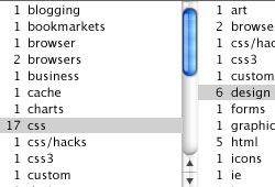
It struck me that a column view would make an ideal ‘related tag explorer’. The first column lists all your tags (perhaps optionally ordered by popularity or name). Each tag is listed with the number of bookmarks to which it is assigned. Selecting a tag filters the bookmark list to show bookmarks assigned to this tag and populates the following column with related tags (i.e. other tags that are assigned to bookmarks in the list). Selecting a tag from the second column has the same effect to show a further refined list of tags in the following column and so on.
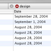
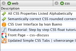
As it is possible that not all the selected tags will be all visible at once I have added a breadcrumb listing the selected tags. This serves as a heading for the links listed below it. The addition of close buttons (X) to each tab provides a means to easily remove a tag from the filter.
The del.icio.us site lets us filter the bookmark list in a similar way by clicking ‘add’ in the “related tags” list. This is great for trimming down the list of bookmarks in the same way digging down the levels of a series of folders makes an item easier to find.
Unfortunaltely if you neglected to add a certain tag when posting a new link
and this link happens to be one you later use to filter your bookmarks it will
fail to appear in the resulting list of links – even if the other tags in your
‘search’ match. Perhaps a solution is a way to perform ranked
OR searches. The returned list would obviously include the
bookmarks which strike the most matching tags first with the following items
catching the stragglers. This could also be useful for searching using
commonly exchanged tags similtaneously such as: ‘macintosh’,
‘mac’, and ‘apple’.
In addition to suggesting the option of OR requests of
del.icio.us, Brad Choate mooted
a future feature of del.icio.us that would allow a tag to be included as a
NOT operator when refining a list of bookmarks. The breadcrumb
could be used to clearly illustrate such a query of your bookmark database.

I haven’t given equal thought towards the equally important posting/editing interface of my dream del.icio.us client. It would make sense to use the same interface somehow as a shortcut to select existing tags. While I’m still establishing my own tag selection ‘structure’, nutr.itio.us has proven extremely valuable by allowing me to survey the tags others have chosen for a particular link. I imagine my need to see the tags chosen by others will diminish as the rate I add new tags slows. As a newcomer to del.icio.us my tags probably still outnumber my links. To reverse this trend and make these tags useful, it’s important I reuse these established tags where they are relevant. A good posting interface would make that easier.
Over to you.
Further thoughts
8 January 2005
Cocoalicious has made progress. It is now a open source project. For those of us not quite up to compiling their own build, 1.0b30 has been released addressing some popular suggestions.
This version allows the selection of multiple tags in the tag listing to
provide an AND search of your bookmarks. Although with over 100
tags in my list the copious scrolling required to locate a few tags makes
this approach impractical. My earlier suggestion of grouping the tags into
folders only solves this for specific, frequently made, searches. It
wouldn’t be worth the effort.
Sorting the tags by popularity, like used in my column view idea, still leaves much to be desired. I stick by the column view as a potential hierarchical tag browsing widget, but perhaps the tags could be sorted more meaningfully.
I’ve since discovered (thanks to del.icio.us/popular) that Pietro Speroni was ahead of me on this with Hierarchical Delicious Free Mind Map. He has followed through with a few spot-on posts regarding the making and function of his Delicious Mind Map Maker.
Representing the clusters in a standard column view could be challenging, but otherwise this is exactly the kind of transformation of one’s del.icio.us data I was envisioning a client bookmark management application making. At first glance the structure, at least, would seem fit nicely into the the interface I mocked up: The initial list in the first column could be limited to the main (or non-sub) tags. Selecting one of these tags would populate the following column with it’s ‘contained’ (or sub) tags and so on. Each selection also populates the link listing below with all the links (or posts) with those tags assigned.
If this doesn’t make sense try reading a few of Pietro’s posts (links above). Thanks Pietro, my dream feels a little closer to reality. I just wish I could help!
29 June 2005
Johnvey demonstrates the merits of a column view for del.icio.us link browsing with beautiful finesse.
Visit del.icio.us direc.tor, add the favelet bookmark, visit http://del.icio.us, click to transform. Wonderful stuff.
21 May 2006
Luis de la Rosa has released a ‘non-lite’ version of his desktop bookmark manager WebnoteHappy. This new version has a few features which make it particularly interesting to me. Primarily it is a tag based bookmark manager with the ‘bonus’ option of syncing with del.icio.us. Each bookmark or ‘webnote’ can be optionally shared with a post to your del.icio.us account. Of course it’s the integrated column based tag browser that I’m most excited to see in action. It’s got me thinking all over again about how this can be used as an aid to tag selection when posting a new bookmark. I’ll post some mock-ups when I’ve solidified my thoughts.
4 June 2006
The mock-up mentioned in May posted on WebnoteHappier.
17 November 2006
Another implementation of the columned tag browser in Notae from Adam Knight.


