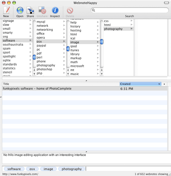
Create a new webnote with a description.
Currently the list is a complete unfiltered list of all my bookmarks with the new addition at the top. Next…
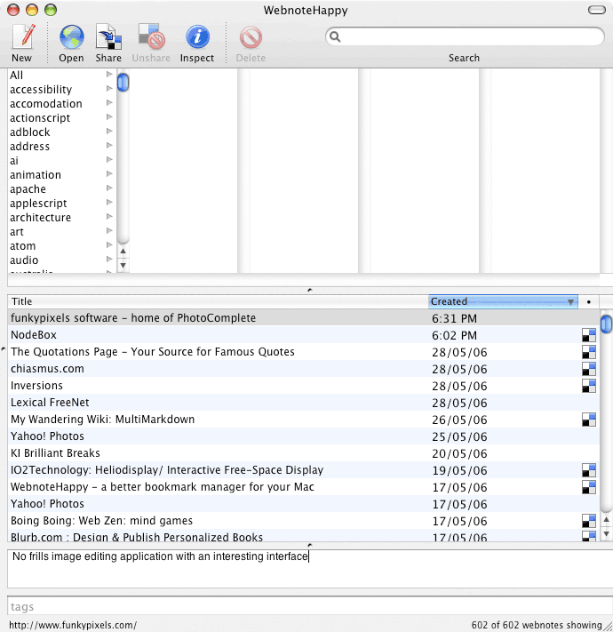
Start typing to assign a tag.
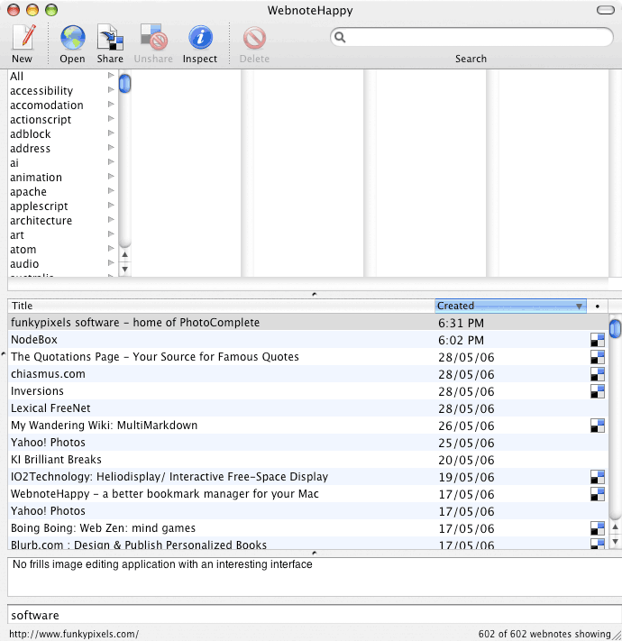
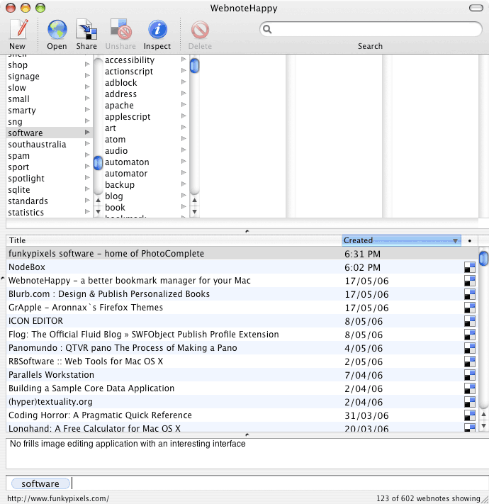
Hit spacebar to complete the tag. In this example, ‘software’.
The first tag is selected in the first column in the background. This populates the second column with tags that have been used in conjuntion with the highlighted tag. At the same time the list of webnotes underneath is filtered to show only links I have already assigned this tag to. Keep going…
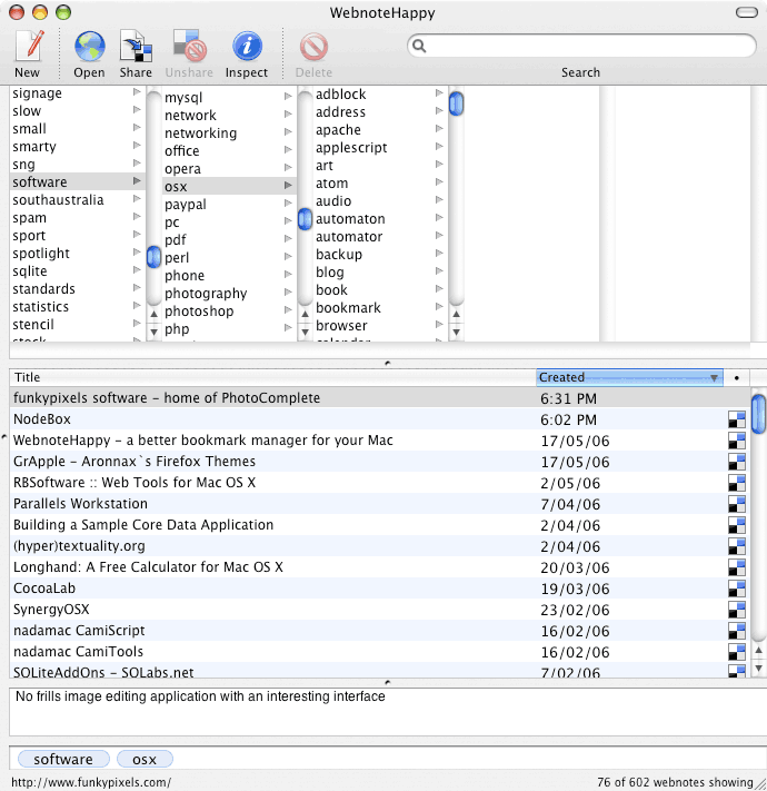
Adding a secong tag: ‘osx’.
Again this tag is highlighted in the tag browser - this time in the second column. Tags which have been used together with both ‘software’ and ‘osx’ appear in the third column while bookmarks assigned with both these tags are listed below. Nearly there…
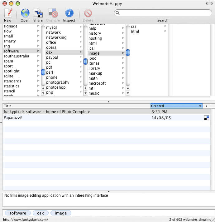
The third tag ‘image’ has a more dramatic effect.
To my surprise I have only tagged one other bookmark with all three tags: ‘software’, ‘osx’ and ‘image’. The tag browser shows me the two other tags assigned to this bookmark. One more…
My last tag makes my new webnote unique.
Assigning ‘photography’ to my new bookmark orphans it in my collection. Meaning it has no siblings which have been assigned the same tags. The lack of tags in the fifth column confirms this. That's it! Blog entry…
