Another NetNewsWire style
- Posted
9 October 2005 - Updated
6 February 2006
A nagging desire to find a novel and useful application of the template.html file in a NetNewsWire style and thoughts regarding the limitations of web typography came together a few weeks ago while reading another of the many blog posts on the pros and cons of flexible vs. fixed width web layouts. Why not use a little JavaScript to make line spacing relative to line width?
I’m demonstrating this idea with a refinement of my previously published easy reading NetNewsWire style – Ollicle Crisp. It seemed appropriate to call my new style ‘Ollicle Flex’. Go ahead and install it if you are impatient, but to get the most out of it I suggest reading a little further first.
Installation and set-up
I have only tested this style in NetNewsWire 2.0.1 (Full version). If it is radically broken in the lite version let me know and I’ll see what I can do to fix it.
- Ollicle Flex ollicle-flex.zip
Posted on 4 February 2006. This is the one to download and install.
Here are the beta versions I posted along the way as I attempted to get this thing to work. I’m leaving them linked here – just in case:
-
Ollicle Flex β¹ ollicle-flexb1.zip
Posted on 9 October 2005. Works fine on my G5 here at home. But not on my G4 at work. -
Ollicle Flex β² ollicle-flexb2.zip
Posted on 12 October 2005. The fix that worked for my work machine. But strangely breaks here at home. -
Ollicle Flex β⁴ ollicle-flexb4.zip
Posted on 27 January 2006. Major update with a couple of additional surprise features! -
Ollicle Flex β⁵ ollicle-flexb5.zip
Posted on 4 February 2006. Resolves a few significant JavaScript hiccups and handful of finicky CSS issues.
Double click the contained ‘Ollicle Flex.nnwstyle’. Selecting ‘Install style’ should copy this file to /Library/Application Support/NetNewsWire/Stylesheets/ where you can place or remove it manually should you choose to. If the style isn’t applied right away try switching to another style and back again.
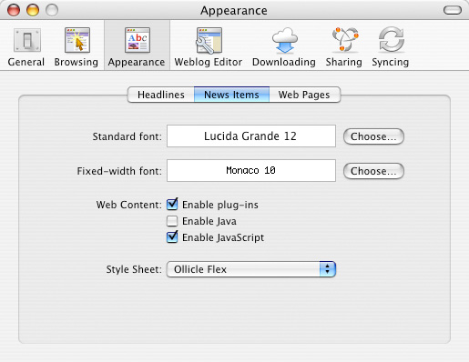
The dynamic line spacing (and other features) for which I named this style requires you to enable JavaScript for news items in NetNewsWire’s preferences. Note that the JavaScript doesn’t work in Combined view. If you have some JavaScript phobia, you’ll still have some nice CSS, but you’ll be missing out on the good stuff.

While you have the preferences open you may wish to select your favoured font for feed reading. Crisp had Lucida Grande set. I have removed the CSS responsible for this font selection in Flex to allow you to make your own choice. Font sizing set here is also respected by the CSS of this stylesheet. Some people felt that the blue rollover on the feed title of Crisp was overkill and I’ve grown to agree. This new style applies a subtle treatment to the feed title which ties in better with NetNewsWire’s own sleek grey look .
If you choose to add a file called adBlock.css to your NetNewsWire Style Sheets directory it will also be applied to feeds viewed with Ollicle Flex. I have not attempted to create an example ad block file. Read more about it in NetNewsWire feed ad blocking with CSS.
Have a play with it and let me know what you think. I’m proud of it and itching for some feedback.
Further thoughts
Update October 11, 2005
I’ve moved my rant on the importance of line spacing from this page to create a new entry – Flex CSS with JavaScript for better reading which focusses on this and the JavaScript that demonstrates my idea.
Update October 12, 2005
Uploaded a new version (2) of the style – fixing a big JavaScript problem. See download link above.
Update October 12, 2005 (evening!)
Here we go again (3) – previous version busted on my home machine. Download above.
Update October 15, 2005
Added links to all the variations of the Flex style which I have posted. The difference between them is very small one or two lines of JavaScript. I’m hoping if I talk about it enough someone with a clue will see the stupidity of my code and correct me (fingers crossed). All three have code which fires the function window.onresize. The code that differs is what fires when the document loads:
Version 1:
MakeLayout("lineflex",15,60,1.4,2.4);
Version 2:
window.onLoad=function(){MakeLayout("lineflex",15,60,1.4,2.4);}
Version 3:
MakeLayout("lineflex",15,60,1.4,2.4);
window.onLoad=function(){MakeLayout("lineflex",15,60,1.4,2.4);}
I posted the rest of the code in a subsequent post.
Update December 3, 2005
Version 3 has proved to not offer anything – don’t bother with it.
Update 27 January 2006
Version 4 posted. Almost completely rewritten JavaScript. Works consistently between machines so far. Please let me know how it works on yours! There are a couple of other notable ‘flexy’ features that warrant some dedicated words. I’ll post them here when I post a non beta version, but perhaps you can discover them for yourself!
Update 4 February 2006
Version 5 posted. Regular use of this style has revealed a few kinks in version 4 which I have since ironed out in 5. Changing the size of the window rapidly no longer confuses the image sizing. Also line-height adjustment is maintained when switching layouts. More on what I’m talking about soon.
Update 4 February 2006 (evening)
I’ve uploaded the first non-beta version of Ollicle Flex and a post NetNewsWire style with free cookies which explains the new image sizing and layout options with a couple of screenshots if you want a preview.