Ollicle Reflex refined for smarter feed reading
- Posted
8 March 2008 - Updated
14 March 2008
It’s been a long time cooking, but I am finally taking version 6 of Ollicle Reflex out of the oven.
Download and install
Download latest version: Ollicle Reflex
Double-click the unzipped .nnwstyle file and NetNewsWire will copy it to where it needs to be.
~/Library/Application Support/NetNewsWire/StyleSheets/
This style uses JavaScript to do some things CSS alone cannot. Make sure you enable it
- NetNewsWire Preferences
- Browsing
- News Items
- Enable JavaScript
- News Items
- Browsing
Requirements
I have not tested this style extensively with anything other than the current version of NetNewsWire (3.1.3) and Safari 3 (which determines the version of WebKit NetNewsWire is sporting).
Note: styles for NetNewsWire 3 do not affect the Combined view – only the Traditional and Widescreen views.
Key features
-
Simple clean style
Doesn’t get in the way of your choice of feed reading font and size. New for Version 6: added some simple styling to make data tables easier to read.
-
Clever image handling
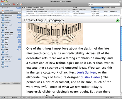
Large images are scaled to fit available space. New for Version 6: automatic alignment of smaller images, avoiding awkwardly squashed text.
-
Automatic line height
Optimises line spacing of the feed text to suit your window and font size. More about this: Flex CSS with JavaScript for better reading
-
Del.icio.us Tagometer
The number of del.icio.us bookmarks for the linked webpage is displayed along with the most popular tags they assigned to it. New for Version 6: a little hackery to see through feedburner urls and a more compact and stylish look.
-
Tidy diff display for recent feed changes
With Highlight Differences checked in NetNewsWires general preferences you can toggle between the current and previous version of a changed feed. New for Version 6: feed changes are highlighted in a vertical bar in the left hand column. Hovering the bar with your cursor highlights additions inline, clicking it hides additions and reveals the deleted content.
-
A choice of layouts
Two layouts to choose from: One column (default for NetNewsWires Widescreen layout) with the feed info in the footer, or two column (default for the Traditional layout) with the feed info persistent in the right hand margin. New for Version 6: now possible to set a default irrespective of your choice of NNW layout (see below).
-
Dark or light theme
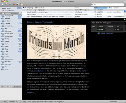
Choose between the default white background or the image enhancing black background. New for Version 6: changed method for setting black as the default (see below).
-
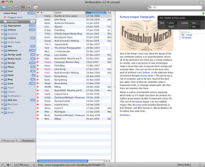
Per feed layout and theme prefs
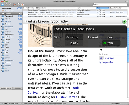
Clicking the little button in the top right hand corner of the feed pane toggles the preference pop-up for your currently viewed feed. Cookies NetNewsWire shares with Safari are used to store your selection of layout or theme for any post from that feed. New for Version 6: the preference pop-up now scales nicely when you make the feed text bigger and smaller with Command +/-.
-
Customisable defaults
New for Version 6: If you don’t like my selection of defaults in Ollicle Reflex I have made a few of the prefences more easily configurable. I have removed the unintuitive hack for changing the default theme (adding “Black” to the filename of the the nnwstyle package). Now you will need to roll up your sleeves and launch your text editor.
Locate the Ollicle Reflex style package
~/Library/Application Support/NetNewsWire/StyleSheets/Ollicle Reflex.nnwstylereveal it’s contents by right (or control) clicking it and selecting “Show Package Contents”.At the top of the contained “javascript.js” you will find values set within the curly brackets of
var userPref = {};. To set a default layout you need to first uncomment the line by removing the//from the start of the line. Otherwise make sure you only edit what falls between the colon and the comma, and ensure you leave the quotes around the layout and skin names. Note the last item shouldn’t have a trailing comma.To see your changes take effect it is necessary to relaunch NetNewsWire so it can update it’s cache of the style.
Maybe someday I’ll try my hand at making a small AppleScript app to edit these options in a more friendly manner. If in the meanwhile you manage to break it (the JavaScript elements of the style will stop working), you can always come back here and download the style again.
Screenshots
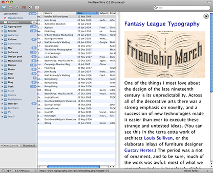
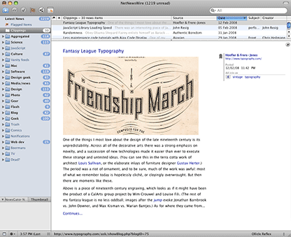
I’d love to have a screencast to give you a better preview of the style. For now here’s a few screenshots that illustrate the font size and layout flexibility. Although, rather than waste time looking at them, I recommend scrolling back up the top of this page and downloading it.
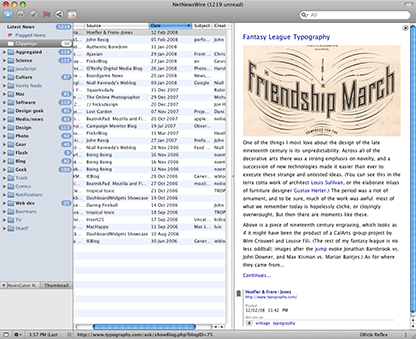
Widescreen NetNewsWire layout
One column layout by default
Larger font size
Two column—smaller font size
Traditional NetNewsWire layout
Two column layout by default
Larger font size
One column—larger font size
Black background
Scripting image layout is tricky
The logic executed to determine if an image should be scaled, aligned or left inline is much simpler than my initial somewhat ambitious scheme. I was driven crazy trying to get my head around the increasingly complex possibilities that cascaded from attempting to consider how to handle clusters of images such as those often found in the FlickrBlog.
After sufficient frustration I decided to focus on the more common occurrence of individual images of unpredictable dimensions alongside or within a portion of text. In a nutshell, the trade-off is that images that ought to sit nicely alongside each other in the one row are now forced under one another vertically. Very occasionally this looks broken.
Many bloggers continue to use double line breaks instead of regular paragraphs. I’ll give them the benefit of doubt by pointing my accusatory finger at their blogging tools rather than their shoddy HTML. Regardless, this made the task of ensuring associated text and images remained close in the layout particularly challenging. I delayed the release of this style until I came up with a means to get the better of this puzzle.
Why spend some much time on a simple looking style?
The consistency and convenience of feed reading comes with a price. In the thoughtfully constructed HTML content of a RSS feed I get the author’s words and images. I also get the emphasis and structure of their sentences and also links to their references. I get their meaning. I don’t get their CSS.
Many readers, who consider themselves visually or design literate, appreciate the aesthetic of the original artifact of the authors website. Many web authors are dismayed to see the effort they put into the presentation of their posts wasted to feed readers who never see the intended context of the site itself. These people don’t need help finding each other. For everyone else, there is work that can be done. The decisions that go into CSS in a modern website address more than just aesthetic vision of the author.
CSS is the primary tool for removng the obstacles to easy reading. A website built within a given layout and structure provides enough restrictions to widths and heights that effort put into molding the text to best fit it’s space is worthwhile. Outside of the cushy environment of the homepage, in the diverse wilderness of RSS and Atom consumption, these constraints lose relevance. Therefore, outside of the author’s site, so does the author’s CSS.
A feed reader style like Ollicle Reflex, if it is to to fulfil the needs of a discerning reader, needs to be much smarter than a style for an average blog. Not only is the content presented by a feedreader more varied (and often broken) than any given site, the user of a good feed reader has a great deal more control over how how these feeds are viewed.
These diverse demands, and my curiosity, have driven me to turn to JavaScript in Ollicle Reflex. CSS alone struggles to keep the content looking consistently considered.
Scratching my own back
Like NetNewsWire, Ollicle Reflex is free. I build it chiefly to scratch my own itches. That said, I love to know others are using it so bring on the feedback!
To all of you who have been suffienctly tempted by my words above to click out of your feedreader to load ollicle.com to best appreciate it’s full artistic intent… Lets say I have put a little more effort into Ollicle Reflex than my site in recent years :/ Might have to get back onto that.
Further thoughts
14 March 2008
Updated the download link above to version seven:
-
User preference for line-height now works (Thanks Matt).
-
Added user preference (in javascript.js) to hide/show the del.icio.us tagometer (Good suggestion Jonathon).
