New NetNewsWire CSS
- Posted
27 October 2004
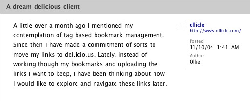
NetNewsWire first provided the facility to style your incoming news feeds with CSS over a year ago. Back then I created a stylesheet for NetNewsWire that kept the news item title visible while you scrolled the page. Version 2 of NetNewsWire (currently in beta) provides a bunch of new elements for a custom stylesheet to get a handle on. The possibilities provided by these new elements, and the fact that my old CSS is broken in this new version, motivated me to create a fresh style for NetNewsWire 2.
Here’s a screenshot:
 .
.
If you are running the beta – install my style and let me know what you think:
-
Download Ollicle Crisp
-
Unzip and place ‘Ollicle Crisp’ with your other styles in:
~/Library/Application Support/NetNewsWire/StyleSheets/
The styles bundled with the NetNewsWire 2 beta give a good taste of what’s possible. Presenting a broad spread between fun and clean utility. I set out to create a design for everyday reading, one that sits back and lets the text do the talking.
I’ve attempted to make the styles respond appropriately to your selected font size and favoured layout. Technically the only new element to my CSS is the display of the URI of the source of the feed. This attribute is made visible with this bit of CSS:
.newsItemSource a:after {
    content: attr(href);
}
When a favicon is available a second <a> is generated, as a
result the above CSS will create the URI twice. This redundancy is removed
with a little more CSS that may be unfamiliar to designers accustomed to
accommodating the limitations of Internet Explorer. :
.newsItemSource a + a:after {
	display: none;
}
I have included some basic comments in the CSS file if you’re interested in reverse engineering the design any further.
Further thoughts
27 October 2004
Update: Fixed an small spacing issue when particularly long Author names wrapped onto a second line.